Autumn Nations Cup 2020 Title Sequence
I was asked by Noah Media Group to create the concept, title sequence and presentation for the 2020 Autumn Nations Cup.

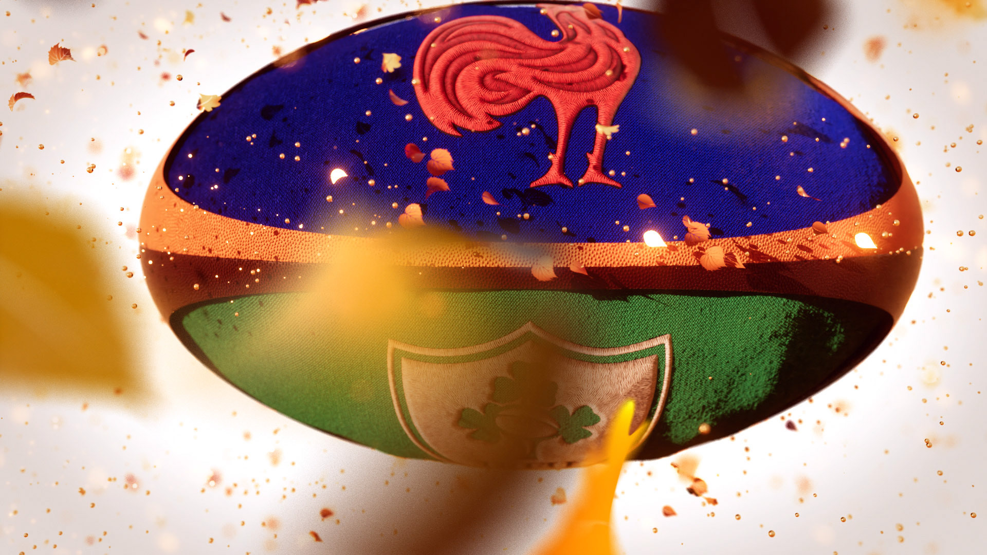
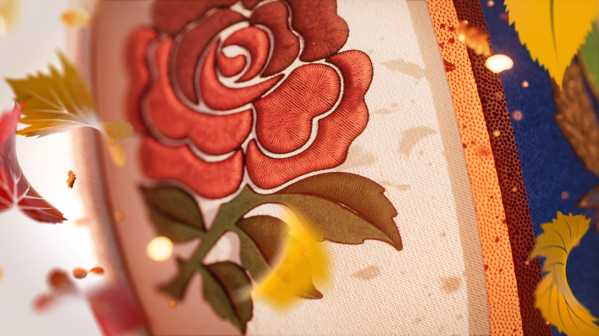
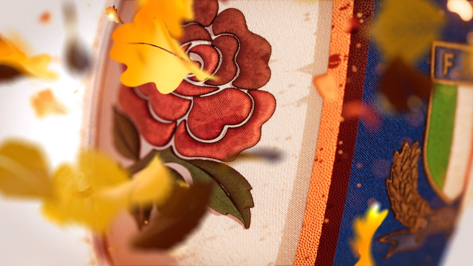
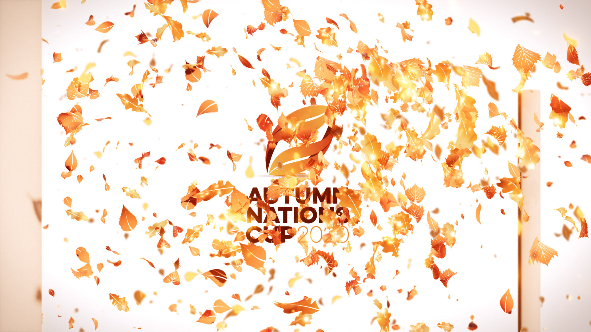
We were given the tournament logo and a few emotive words to start with and built the concept from there.
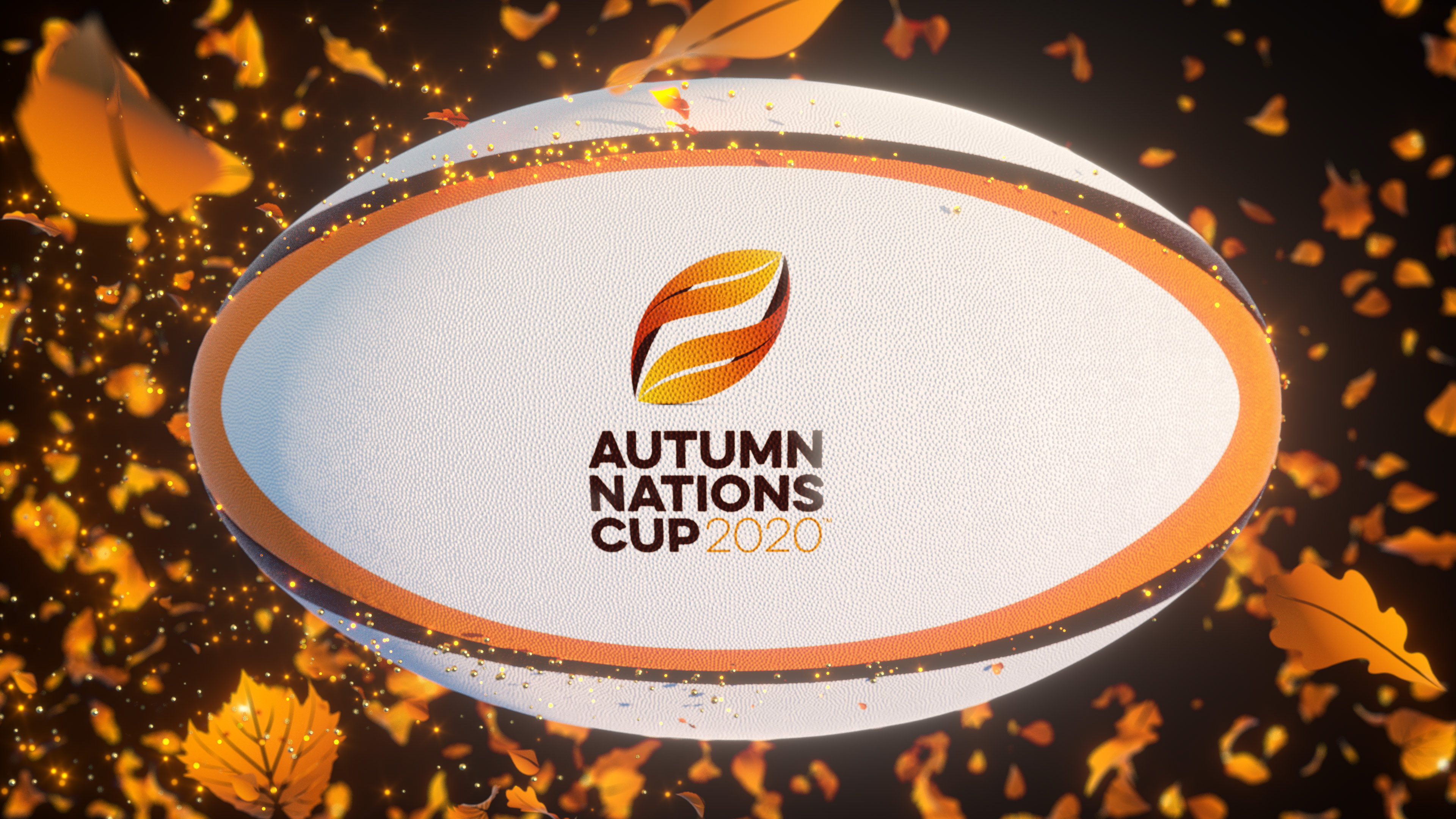
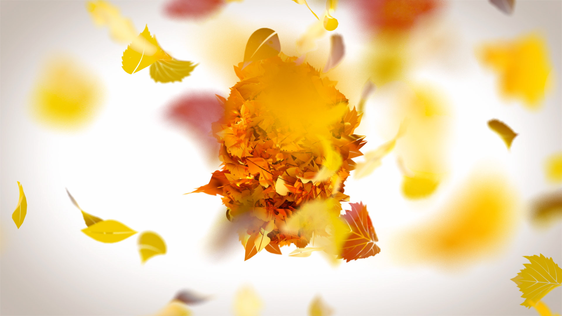
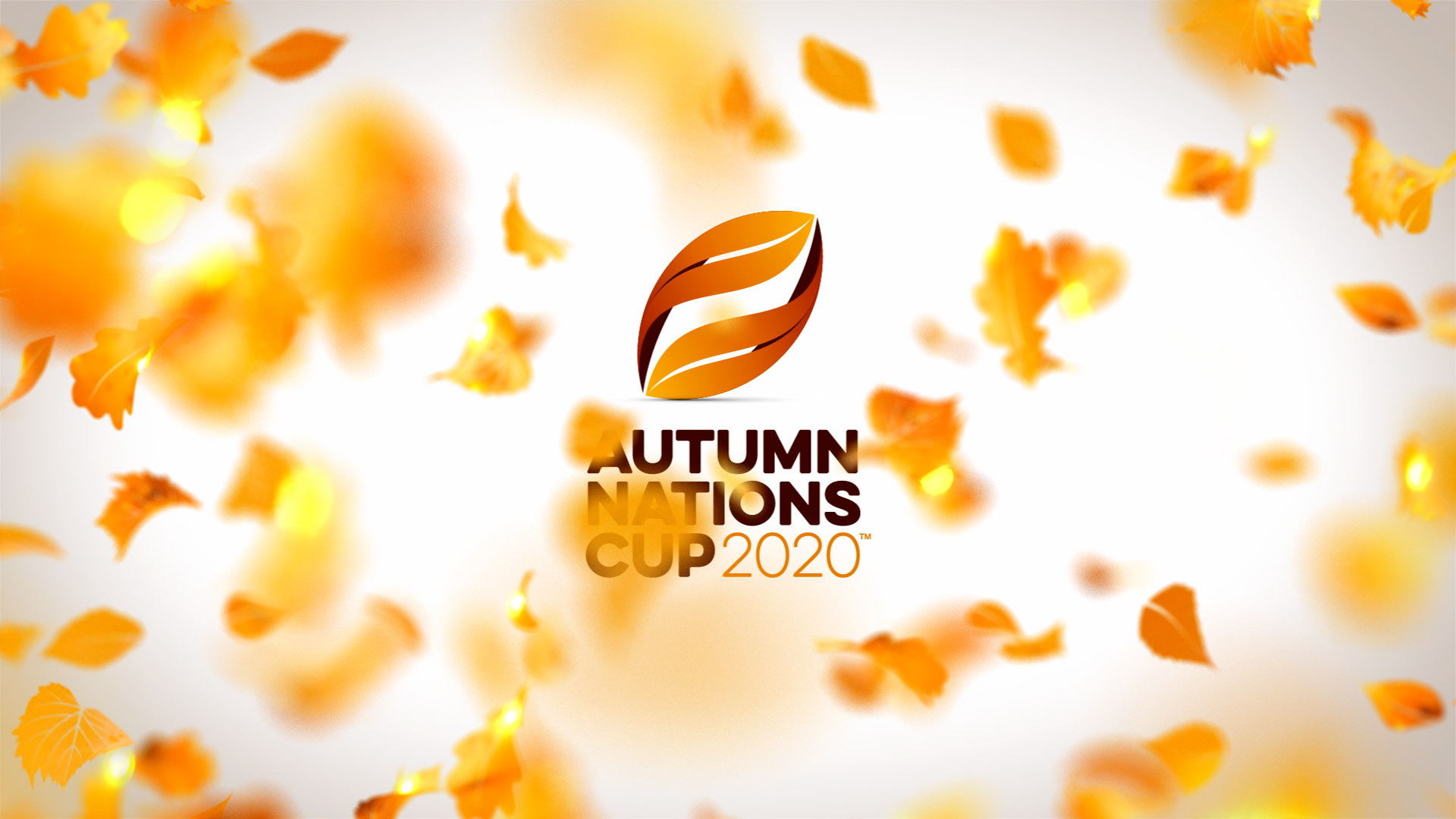
I had a pretty clear idea from the start that I wanted to really leverage the autumnal feel, picking deciduous leaves of the most common trees from the region, I created a particle world filled with russet and golden shades.
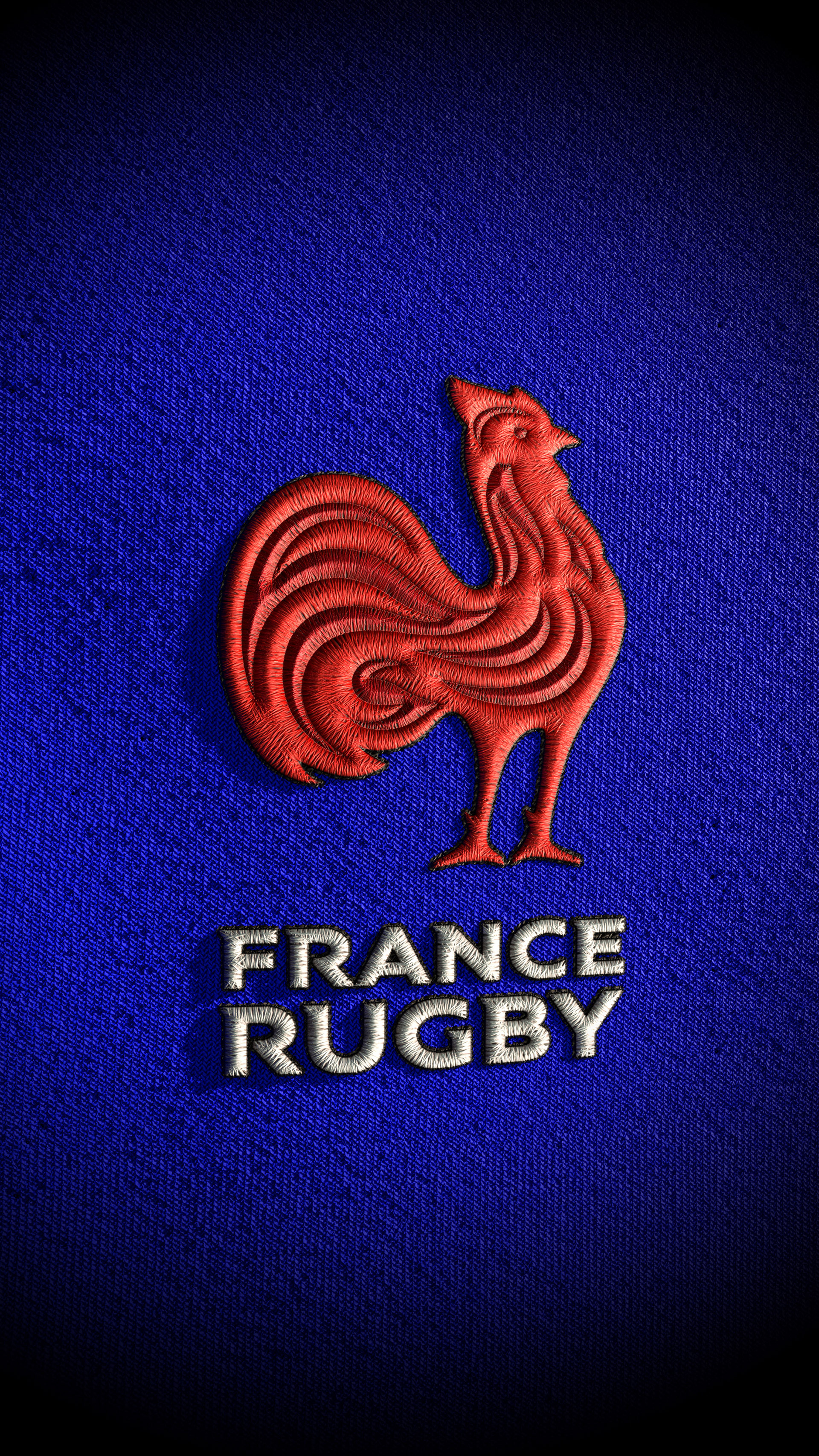
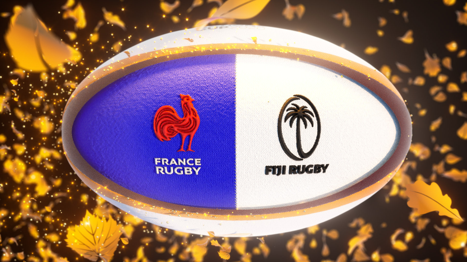
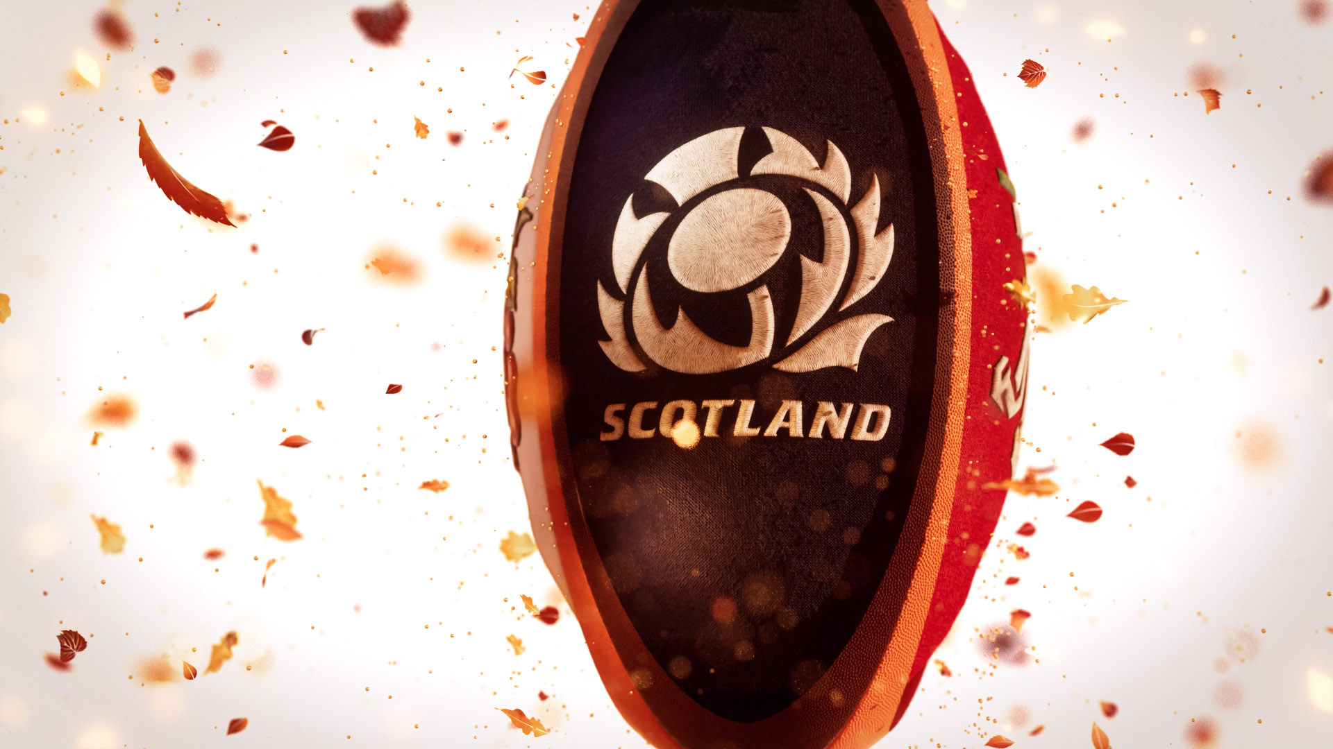
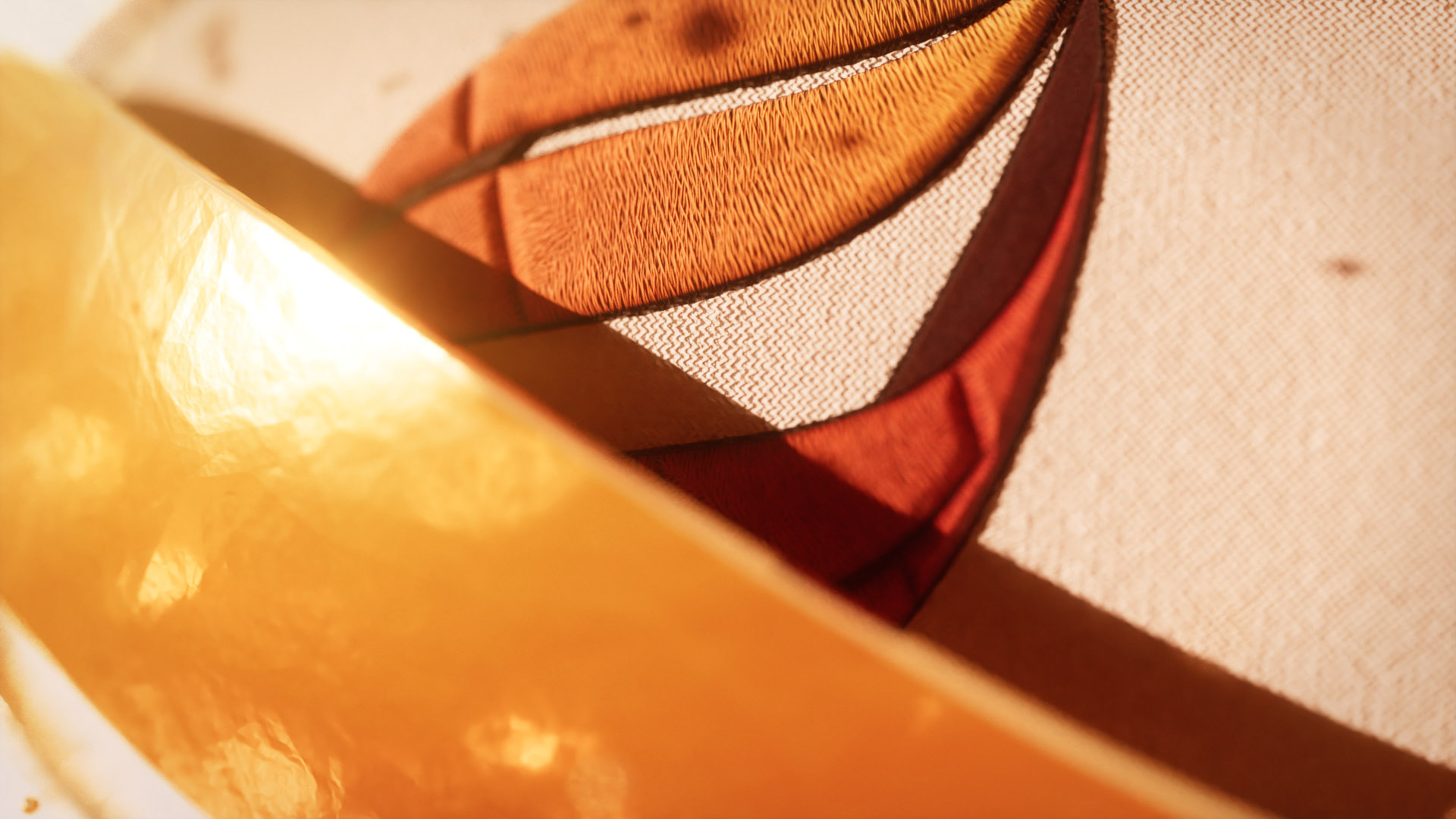
The ball was wrapped in a textured golden rendition of the logo motif (dubbed the acorn to make production and feedback way less confusing). The representation of the teams was achieved by pulling the panels away to reveal the competing nations beautifully embroidered onto their primary shirt colours as the ball twirls through the air.
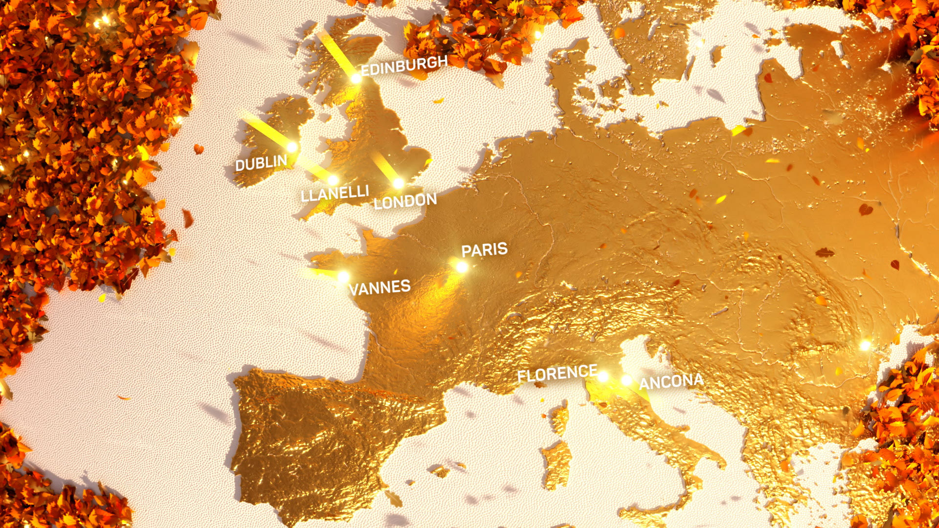
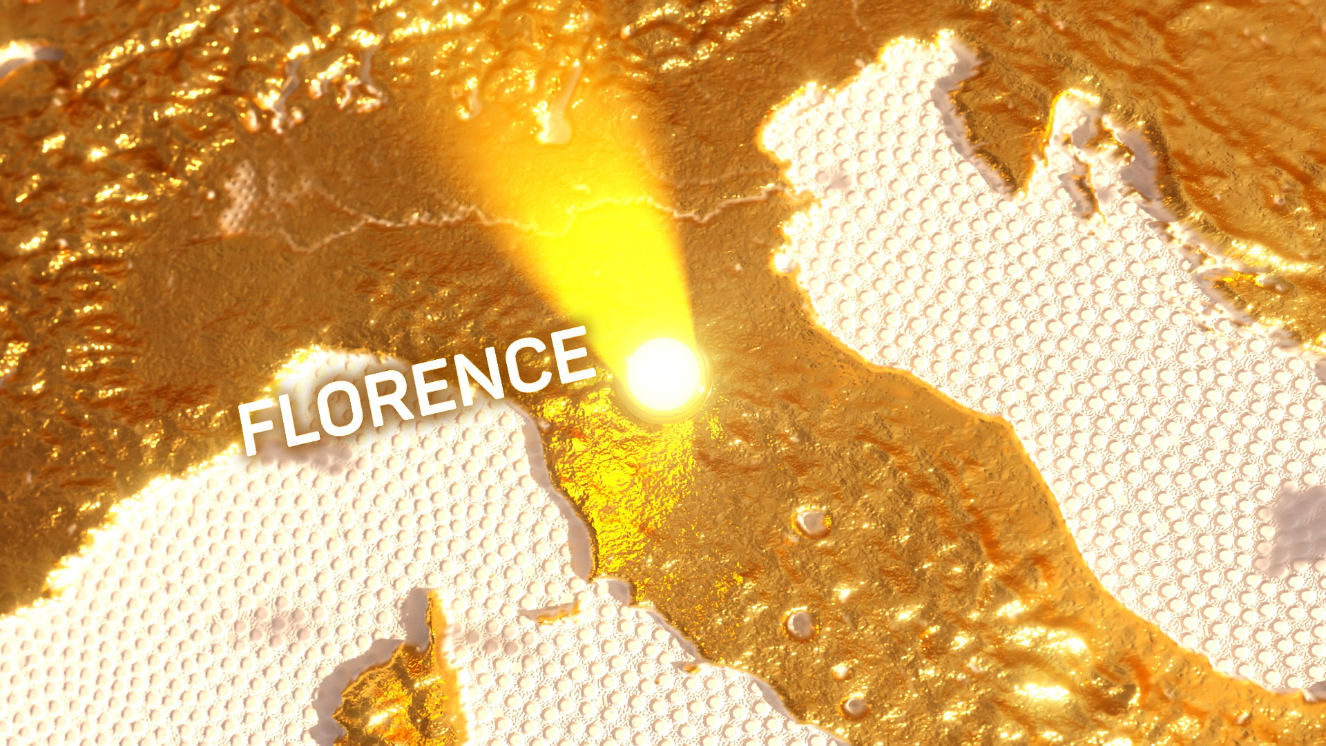
This concept then flowed into the rest of the branding with the visual language created for the title sequence used to create the maps, bumpers, stings and other elements. By either using the leaves, acorn or gold separately or in unison.
